Brand standard · October 2026
Good is practiced, not promised.
This is the part everyone sees first. A brand is built the other way around, from its character out, so this page digs down to it, one layer at a time.
The mark you see first
01 · SurfaceA record adapter: the part that lets a single play on any turntable. Ours is a G with a c at its hub.
The mark signs our work and doesn’t lead it, with one exception: on the homepage, it turns at the center of the record.
- 1Rim · the G A ring from radius 52 to 76, open at the upper right where the crossbar comes in. Its outside edge is the adapter’s.
- 2Hub · the c A ring from 17 to 38, open to the right. Its counter is the spindle hole: on a turntable, the spindle comes through here.
- 3Crossbar · the mouth The G’s own spur, run in across the gap to the hub. Turned to the side, the mark is a face and this is its mouth, a slight smile; on hover it smirks.
- 4Spokes · two The two short bridges, upper left and lower left, that hold the hub inside the rim.
- 5Tabs · three Low tabs out to radius 81, at the top, left and bottom. 81 units is the record’s 1.5-inch hole, so the tabs grip it as a real adapter’s do.
- 6Eye · the hinge A 16-unit square, printed magenta over yellow so it reads red. It is the face’s eye, and below 24 pixels it drops out.
The face, in motion
Hover over the mark at the foot of any page. It spins once, the way a single turns, comes to rest upright, and winks.
It turns clockwise about its spindle, slow to start and slow to settle, then shuts its eye for a beat and smirks before the word GOOD opens from its side. Anyone who asks their device for less motion sees it smile and nothing more.
- 01 · At rest · 0 msA slight smile, the eye open.
- 02 · A quarter turn · 200 msIt starts slowly, as a record does.
- 03 · Half a turn · 270 msUpside down, at its fastest.
- 04 · Three quarters · 360 msThe long settle begins.
- 05 · Upright again · 700 msIt comes to rest the right way up.
- 06 · The wink starts · 770 msThe mouth turns to a smirk.
- 07 · Shut · 880 msOne beat, the eye closed.
- 08 · Open, smirking · 1100 msThen GOOD opens from its side.
Make Good Work
The word GOOD is built, not typed: the G adapter as its G, an O cut from a square, a screened O with its bar that turns, and a D with a square cut from its side. On the mark, the G’s red eye makes that cut: it strikes the first O, a round ripple in a square hole, turns the second O’s bar, and comes to rest in the D.
- 1O · square, hole cut A square of 100 with a circle of radius 39 cut from its center, after Lissitzky’s Of Two Squares.
- 2O · screened disc A disc of radius 50, screened at the brand’s middle density, with a hairline at its edge.
- 3The bar, which turns Fifty long and eight thick, from the disc’s center out. It is the hand that draws the disc, and in motion it turns.
- 4D · stem and bowl A stem 31 wide and a bowl of radius 50, cut as one shape.
- 5The hinge, in motion The G’s red eye, on the mark’s hover: it strikes the first O, where a ripple spreads and fades; turns the second O’s bar as it passes; and comes to rest in the D, where it leaves a square cut from the D’s left side and is gone.
- 6D · the cut A square of 24, cut from the D’s left side at its middle: where the red came to rest.
Color and type
02Color, spent by proportion
Field · about 64%
The ground, read as open space. #F5F0EC
Ink · about 18%
The mark, the drawing lines, the volumes. #2D0A3A
Screens · about 10%
Every gray is a line screen of ink, never a tint. ink at 50, 33, 20%
Hinge · 4% or less
Our only red, made by printing magenta over yellow. It sits beside the one thing a page asks you to do. #FF2600
Signals mean something, so they are never decoration
Purple
Structure: construction, dimensions, numbering. #7B2FBE
Magenta
In our drawings, magenta marks the claim: the one point a drawing is making. #FF2D87
Yellow
Observation: what was seen or measured. #FFD600
Teal
Consequence: what it costs or causes. #00B8A9
Green
Survived scrutiny. Kept for verdicts that held up. #00C04B
Type
Archivo, for headings
Atkinson Hyperlegible Next, for reading
Atkinson Hyperlegible Mono, for anything that names or measures
Every size comes from one golden-ratio scale. A study of our type sets each one out and explains it.
How it’s drawn
03Twenty-seven rules, from a black square to a winking G. They come from two painters in one art school: Vitebsk, 1919.
Malevich had reduced painting to flat forms on a white field; his Black Square was first shown in Petrograd in 1915 (Tate). In Vitebsk, where both taught, Lissitzky took those floating shapes and gave them depth, drawing them in axonometry rather than as flat planes of color (MoMA). He called the result a Proun, usually read as a Russian abbreviation for “project for the affirmation of the new” (Cleveland), and described each one as a station between painting and architecture.
Our Proun plates, our technical drawings, our small animations and our marks all follow the same grammar. Each rule says whose it is: Malevich’s or Lissitzky’s own words, in English translation; a museum’s reading of their work; or ours. Every use of it on a screen is ours, derived from them: no source talks about interfaces.
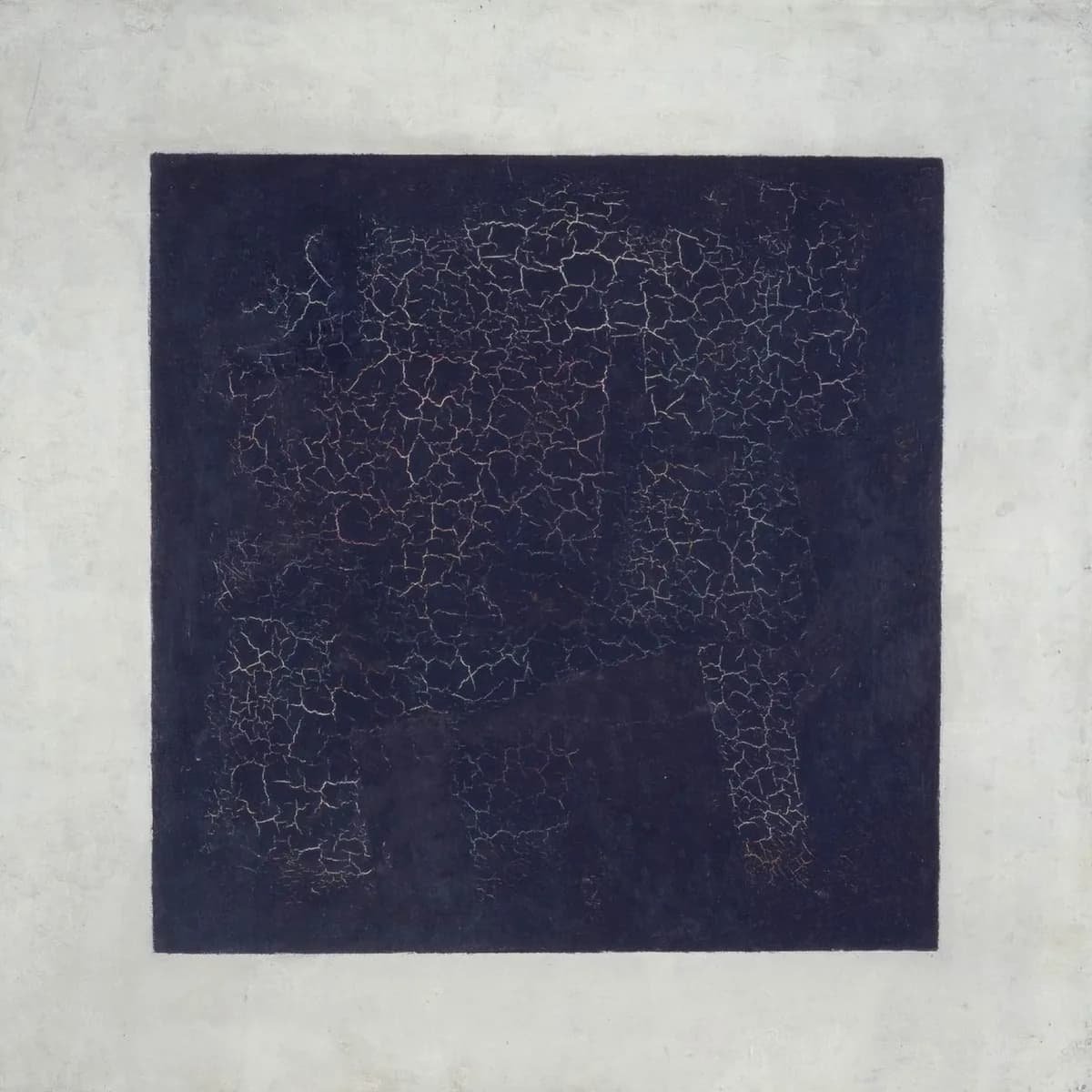

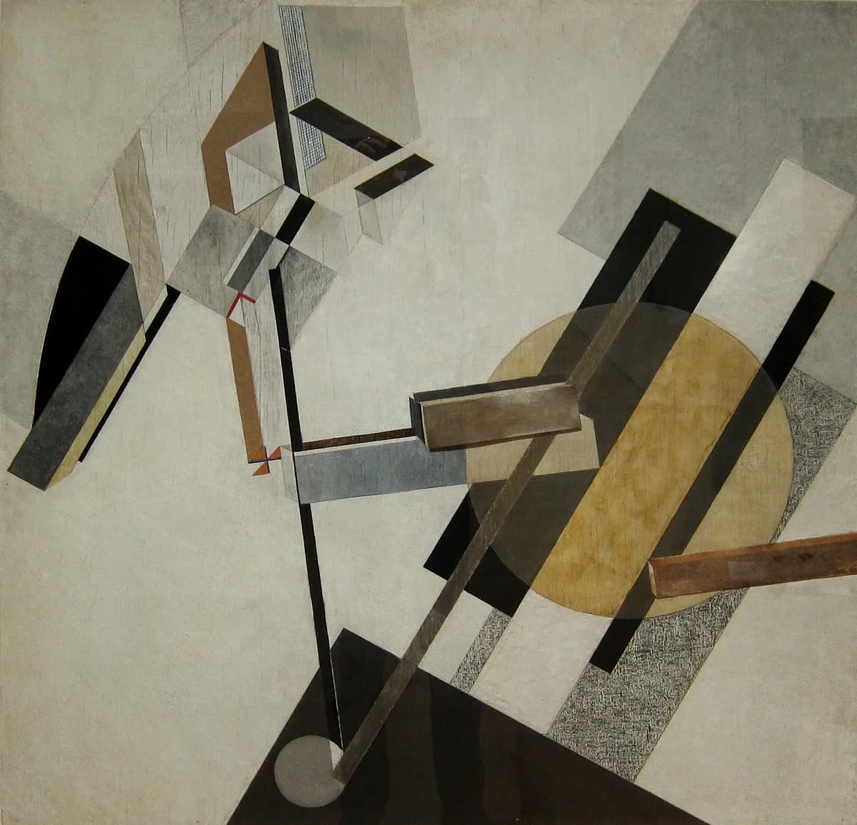
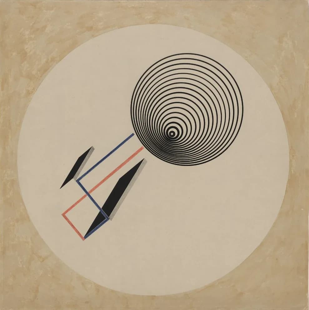
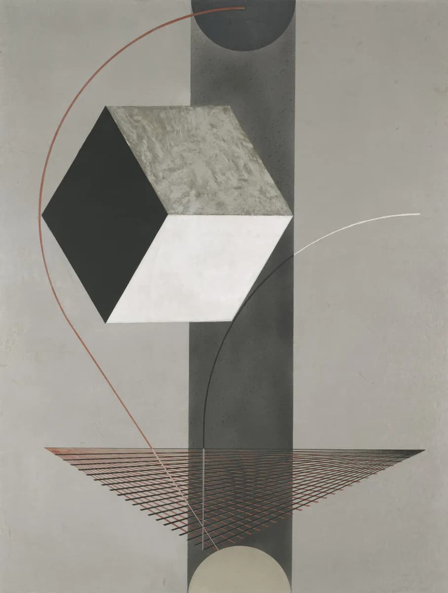


Malevich reduced painting to a few forms, and Lissitzky built with them. We build with them too.
- The adapter
- Our mark is a record adapter, the small part that lets a single play on a turntable built for bigger records. That is our work. We connect the way a business already works to the web, and we don’t ask it to change into something else.
What it means for us
- Inventive
- El Lissitzky made his Prouns by turning the sheet and building on what was already there. We work the same way. We start from what a business already has, like its records, its photos and its habits, and show it from a side no one had tried.
- Rigorous
- Lissitzky left the lines that built each picture where you could see them. We leave our working showing the same way. Our prices show how we worked them out, and the tests our site has to pass are written down on this page for anyone to read.
- Civic
- A Proun has no fixed top, so the person looking decides which way is up. We build with the same respect. Anyone can pause what moves on our pages, and we save our one red for the single thing we are asking you to do.
Brand as Code
04We treat our brand the way we treat our software: written down as code, and tested on every release.
A brand guide describes how things should look and sound, and then everyone hopes. Ours is a set of tests. Our type scale, our colors, our drawings, the facts we publish, even what our chatbot may say are written as rules a machine can check, and a release that breaks one doesn’t ship.
The tests come after the character work above them. They guard what we decided; they don’t decide it. They check what a machine can measure, and whether a page is any good is still a person’s call.
Here is each test, where it runs, and, where it has, what it caught before anyone saw it.
How we’re described
Search, maps, AI assistants and link previews all describe a business, often before its own website does. We keep one record of the facts and check everything else against it.
Canonical Presence
paulagallery.com
Every fact about the business lives in one record on its own website, and every other listing is checked against it.
How it’s measured A check runs every morning and emails us the day a gallery listing changes, sells or can’t be read.
What AI says about us
get-a-bob.com
We ask search engines and AI models what they know about us, the way a stranger would.
How it’s measured Each month the same questions go to search and to AI models, and every answer is recorded and checked against what’s true.
Share previews
This site and get-a-bob.com
Every page we publish carries its own picture and words when someone shares it.
What it caught Our drawing grammar got a page of its own on October 13, 2026, with no share image. The build stopped until it had one.
How it’s measured The build stops if any page is missing its share image.
LLM view
A free tool, for any page
We read our own pages the way an AI model is given them, before we trust what it says about us.
How it’s measured Any page, shown as a model receives it: as text, before its scripts run, with every hidden word showing.
How we look
Our identity isn’t a style guide we hope people follow. It’s the thing every release is checked against, on screen and, soon, in print.
Design tokens
This site and get-a-bob.com
Color, type, spacing and motion come from one source, in our code and in Figma.
How it’s measured Rebuilt on every release of get-a-bob.com. On this site, a raw value anywhere in a stylesheet stops the build.
Type and rhythm
This site and get-a-bob.com
Every size, space and line sits on one type system, at every screen width.
What it caught On October 10, 2026, short code words set inside sentences made their lines taller on Linux, and every line after them slipped 3 to 6 pixels off the reading lines. On October 13 a new layout on this page set every line below it 12 pixels off. Both failed before anyone saw them.
How it’s measured A browser test measures every line of every page on a desktop and two phones.
Contrast
This site and get-a-bob.com
Every word stays readable against whatever is behind it, even where our colors change with the time of day.
How it’s measured Each label in our drawings is measured at 4.5 : 1 or better; get-a-bob.com’s footer is checked in all six of its daylight colors.
Charts from live data
This site, on Open numbers
Figures drawn from our own numbers keep our inks, keep their labels clear, and never show a number we’ve held back.
How it’s measured Every figure is drawn again with test numbers and checked against the rules before it publishes.
Print and merch
In development, for our first numbered runs
The same rules on paper and cloth: our inks only, lines heavy enough to print, artwork inside the safe area.
How it’s measured Each print file will be checked at its true size before it goes to the printer.
What we say
Our pages and our chatbot should say only what we’d say, and nothing that isn’t so.
Chatbot voice testing
get-a-bob.com
Ask Bob answers questions about Robert’s work, and is graded on every answer it gives.
How it’s measured Twenty questions, each with the facts a good answer must carry, the claims it must never make, and the ones it must hand back to Robert, plus house rules on every reply.
Content guards
This site and get-a-bob.com
No placeholder text and no unconfirmed claim reaches our live sites.
How it’s measured The build stops on any fact still marked unconfirmed, here, or any page still holding a placeholder, on get-a-bob.com.
Accessibility and motion
This site and get-a-bob.com
Anyone can use our sites: with a keyboard, a screen reader, older eyes, or less motion, and anything that loops can be paused.
What it caught On October 12, 2026, the test that posts every form with JavaScript off found that nobody could open the Syrniki order form that way. It was fixed the same day.
How it’s measured Accessibility audits run on every change to get-a-bob.com; here, browser tests check that everything that moves can be paused and holds still for anyone who asks.
Running on this site, on every build
Type and rhythm
scripts/check-rhythm.mjs
- Every size, leading and space sits on a 4px lattice.
- Reading type sets at the golden ratio, 20 on 32. Headings carry that line’s air, so they set closer the larger they grow.
- Text sizes step by the square root of the golden ratio, and two steps make the golden ratio itself.
- The reading measure is 21 lines of body leading wide, and reading text is never narrower than 40 characters.
- Every size is bound to its own leading, and every line box lands on the lattice.
- Nothing enters as a raw value: no pixel sizes, spacing or offsets in any stylesheet or inline style.
- Layouts change only at the five named breakpoints.
Drawings from live data
scripts/check-open.ts
- Drawings use only our inks and their gray line screens. Words are set in dark purple ink or the cream page color only.
- Every shape and every label lies on the plate, and no two labels overlap.
- The magenta square marks the one thing a drawing asks you to do, and no drawing uses more than two.
- Motion is quiet: three loops at most, each starting from where it is drawn, and the pause control’s corner kept clear.
- Every number a figure prints is in its description, so a screen reader hears it too.
- A figure never shows a number its table keeps back: drawn again with every unpublished number changed, it must come out the same.
Words in drawn scenes
scripts/check-scenes.mts
- Every label in a scene reaches 4.5 : 1 contrast against what is drawn behind it.
- Every label is at least 12.5 pixels when the scene is shown at figure size.
- A label that sits on a box stays inside it.
Ways to work with us
05All of it is experiment-led: we test-drive everything, so you’re not playing in traffic. Some of it is free, and all of it starts small.
- A free trial of TerraQuotes
- Our flagship, TerraQuotes, lets a landscaper give customers a price online, worked out from the county’s map of each yard. Landscapers can try it free.
- Free tools
- Tools that show a website the way different people meet it, free for anyone.
- Consulting engagements
- Product thinking and software design, run as trials with a date.
- Demos of solutions
- A working answer to a market problem, built so you can decide on something real.
- New ventures and partnerships
- If you have a problem worth a business, we’d like to hear about it.
A promise you can check
06The promise
Good is practiced, not promised, so we don’t promise to be good. We promise something smaller, which you can check.
We’ll build from what you already have, show it working before you pay for more, and leave you better off whether or not you keep us.
Anyone can call themselves good. We would rather you judge us on what we’ve done, so here is the proof we have so far.
Experimental- Art businesses
- An artist’s pricing, galleries and archive brought into one catalog that sells for her.
- Landscapers
- TerraQuotes prices a yard from the county’s own parcel data, before anyone drives out.
Good Citizenship · Trails
Protect Our Trails, First Responders, and Community
Our petition to Phoenix: on Excessive Heat Warning days, keep the trails open instead of closing them early. Hikers would scan a code at the trailhead to say they understand the risk. It protects first responders, and it tells the city how the trails are really used.
Started in Phoenix in November 2024 and addressed to the Mayor and City Council. Together, we can empower everyone to be responsible stewards of these incredible public lands, keep trails accessible, and ensure that taxpayer funds are used for genuine emergencies.
Join the PetitionWho we work for, and who else they could hire
07The people we serve, in order
- Small businesses
- Civic projects
- Early-stage founders
Who else they could choose
Agencies, consultancies, their own in-house team, or a freelancer. The ones we admire are the boutique consultancies: small, senior, and close to the work.
ExperimentalWhat we hold to under pressure
08Everything above is built on this. Three traits, from our tagline, each keeping the other two honest.
ExperimentalThe interview we used to find them, with the whole deck of forty-eight traits, is yours to use.
- Rigorous
- We test every idea against the people it’s for, ours included, and keep the dates we set. Alone, rigor turns cold; invention keeps it lively and civic sense keeps it kind.
- Inventive
- We use what’s already there in new ways. Alone, invention gets clever for its own sake; rigor makes it prove itself, and civic sense makes it useful to someone.
- Civic
- We build for the people a thing serves. Alone, civic sense turns preachy; rigor keeps it factual and invention keeps it fresh.
Characters we recognize
Each of these leads with one of our traits and is held up by the other two. We try to hold all three in balance.
 Volvo
VolvoRICleads with rigor
The car people trust to be tested. It invented the three-point seat belt in 1959 and left the patent open for any carmaker to use.
 Bellingcat
RICleads with invention
New ways to investigate from public evidence: photos, maps, satellite images. Every claim is checked, and the methods are taught to anyone.
 Wikipedia
RICleads with civic sense
Free to read and to edit, run by a nonprofit, and every claim it makes asks for a source.
Names used for comparison only. We aren’t affiliated with any of them.
| Trait | In what we offer | In what we make | In how we work with you |
|---|---|---|---|
| Rigorous | Trials with a date on them, and a working demo to judge at the end of each. | Checked on every build. Prices that show their working. A check that says “couldn’t read it” rather than pretending it passed. | We tell you what didn’t work before you ask, and we publish our own numbers, including the ones that go against us. |
| Inventive | Demos of answers to real market problems, and free tools anyone can use on any website. | Built from what you already have: the county’s parcel map, the email you were sending anyway, the website you already own. | We build it into your own site instead of selling you another subscription to keep it alive. |
| Civic | A free first call, and small businesses first. If we’re not the right people, we say so and point you to someone who is. | Made for everyone who has to use it, which our own free tools test: older eyes, a shaky hand, a keyboard, a screen reader. | Nothing goes out without your yes, and we never win at your expense. If the deal is bad for you, it’s bad for us. |
Where it started
09 · BedrockA corporation built around software ventures
Good Citizens is a startup. We build and look after our own ventures, and we help other people build theirs.
We taught ourselves to build this stuff, on very little, and it taught us to make every dollar count.
That’s still who we build for: people who can’t afford to waste money on software that doesn’t work.
It’s not enough to make good work, we have to make Good work too.
Source
Scott Lerman, Building Better Brands: A Comprehensive Guide to Brand Strategy and Identity Development (HOW Books, 2013). The order is his, character first and the logo last, and so is the rule that a character is three traits and no more. The rest is ours: that the three should balance one another, the deck and its three families, and the interview that sorts it. This page is set in the order people meet a brand, which is the reverse of the order we build one.